Flemington Post-War Nostalgia
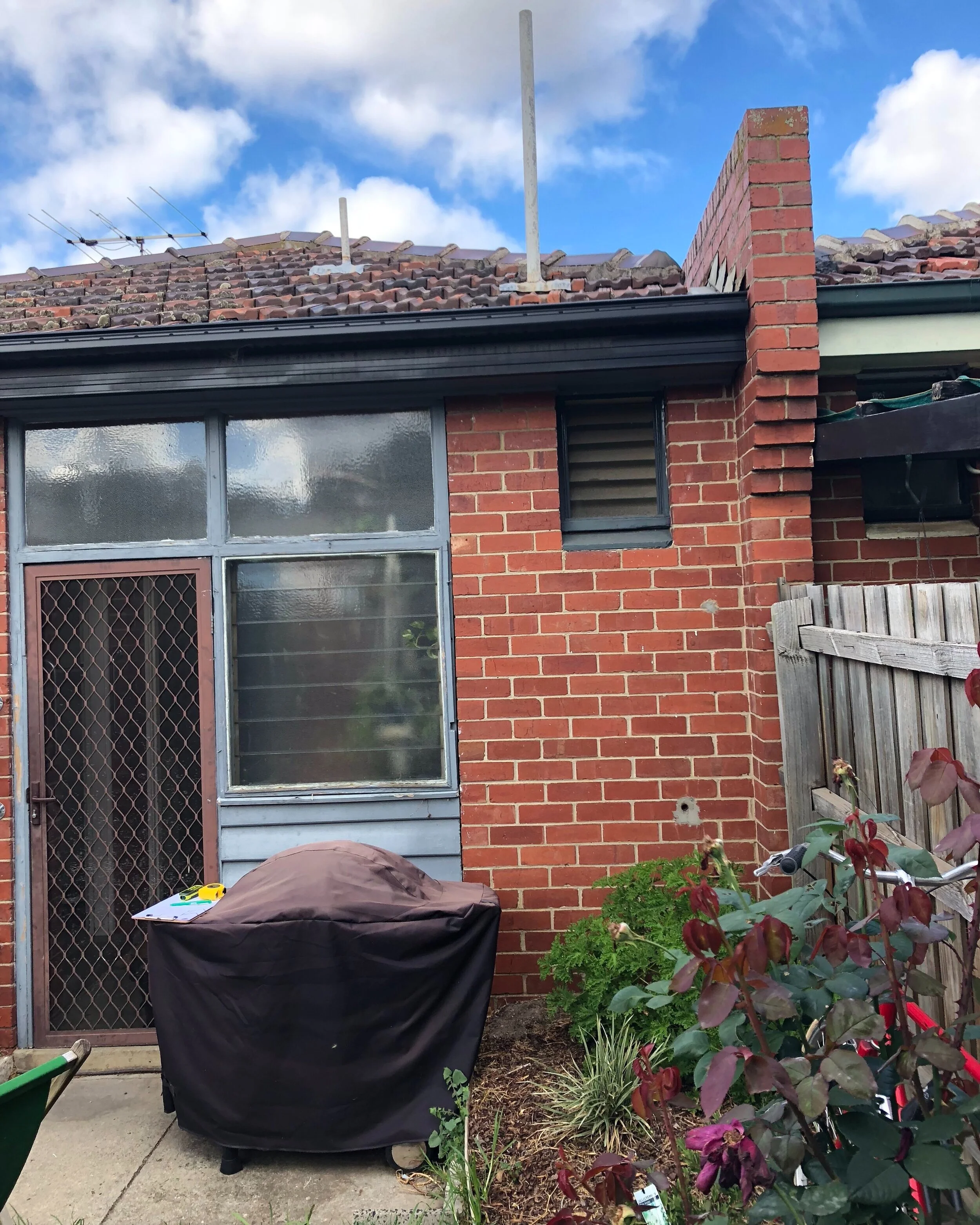
Meet Beatrice, a post-war semi who has had the fortune of staying in the same family since being built in the 1940s. The Melbourne home carries many memories. Maintaining a connection to the past was an essential aspect of this project for the current generation. Architect Lisa Breeze has crafted a unique forever home that is timeless yet nostalgic, a space that weaves existing details into a 21st century lifestyle offering.
Scope of Work
Extension to the rear of the property
Upgrade of kitchen and bathroom
Refresh of bedrooms and living area
Minor exterior restoration work
Landscaping.
Project Details
Location: Flemington, Melbourne
Built: 1940s
Style: Post-war
Heritage Status: n/a
Work Completed: Alterations & Addition
Architect: Lisa Breeze Architect
Builder: Silverstream Constructions
Joinery: Silverstream Joinery
Landscaping: Greenbits
Stylist: Natalie James
Photography: Cathy Schusler
The current owners, who named the home after a Great Great Aunt (and original owner of the property), approached Lisa in 2018. Although the desire to upgrade the brick home had been brewing since moving in, 12 years prior, time was a blessing in allowing the property to reach its full potential.
The brief was to “honour its heritage in as many ways as possible”. All of Lisa’s projects deal with existing builds and bringing a client’s dream to life in a period home is something she excels at. The clients knew, to a degree, what they wanted when they approach Lisa. The overall feel, sympathetic approach and retention of original elements were set. When discussing the approach for Beatrice, Lisa described the project as one that focused strongly on preserving existing features and required attention to detail, trial and error and a willingness to think outside the box. The delicate balance between context, client expectations and realities demanded a dedicated and creative approach from Lisa, which she delivered and is the reason for its success.
Floor Plan and Spatial Layout
The primary focus for the upgrade was the kitchen and bathroom, but a desire to increase natural light and create a better connection to the outdoors led Lisa to explore options that weren’t initially on the cards. The existing home featured what Lisa describes as a “rabbit warren” of spaces at the rear and included the kitchen, bathroom and laundry. Lisa proposed completely reworking this area in order to create a more functional and liveable space. A very modest extension of 8sq m opens on to the back garden turned outdoor living area. By opening up the back end of the home, Lisa has created spaces that feel larger and maximise a small footprint. She reminds us that spaces don’t have to be physically large to feel spacious. The new kitchen is open plan with integrated appliances and laundry facilities, and includes a dining area, historically located in the living room. The new bathroom also shows off an open plan approach and, despite being relocated, maintained its original footprint.
Restoration - What Stayed
“Every detail, material choice and colour in the home is inspired by the original features and the era of the dwelling.”
Having a personal connection to the space meant the clients were keen to keep as many elements as possible. “The plan was always to design an update in keeping with the era and style. The family history and sentimental connection only strengthened this resolve, and we were quite particular in doing everything possible to maintain some features and re-use fixtures and fittings where possible.”
Building fabric: The exterior fabric of the building is mostly retained. Minor restoration works, like re-painting exterior timber elements, has renewed the street appeal of the home and preserved its character. Bricks removed from the rear as part of the extension were able to be cleaned and utilised within the build.
Windows: Existing windows were kept and retro fitted with double glazing to improve passive thermal qualities. The sashes were removed and fitted with the additional glazing, allowing existing frames and sashes to stay. Although this was a complex process, it actually proved to be a more economical solution than a straight replacement.
Internal Detailing: The front rooms maintained original details including cornices, skirtings and architraves. The intention had also been to renew the existing floorboards (the floral Axminster carpet having been regretfully pulled up previously), but the discovery of damage, after removing a couple of layers with the sander, meant they needed to be replaced.
Living Room: In the living room, the existing fireplace, including brickwork, mantle and mirror, are original and now feature a retro fitted fire box to align with current building standards. The glass doors were also retained, although the fluted glass is not original, rather an addition previously made by the client to match other existing elements.
Kitchen: One element that the client’s heart was set on is the original kitchen cabinetry door handles. Knowing these would be difficult to replicate, the decision was made to re-use them on the new kitchen joinery. While hardware rarely survives a renovation, the inclusion here elevates the space and creates a physical connection to the original kitchen for the client. The kitchen tiles were also salvaged and re-used as a splashback in the new laundry cupboard. As a note, the existing kitchen is thought to be a re-fit from the 1950s.
Liveability and Upgrading to New Features
This era and style of home lends itself to contemporary updates more so than earlier periods. Minimal detailing and simple decorative elements allow later features to sit more comfortably within the space. Establishing the right balance isn’t simple though and Lisa has skilfully maximised the beauty of the existing home while improving its liveability. All the mod cons are neatly incorporated to meet contemporary living ideals, like USB ports, a wine fridge and integrated kitty litter (one of our favourite features).
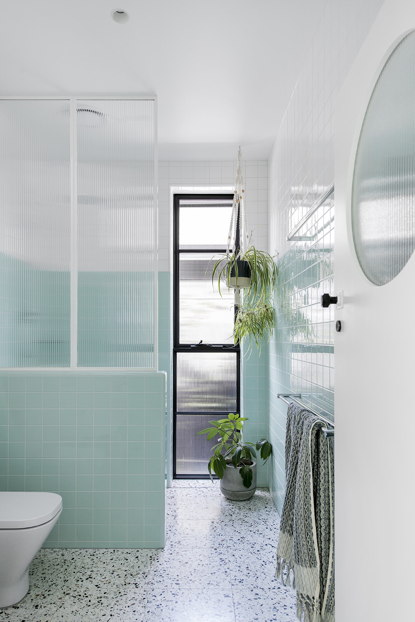
The star of this project is the kitchen joinery. While heavily influenced by the existing kitchen, integration of appliances, streamlined detailing and modern finishes has produced a highly contemporary feel. The curved cabinetry, fluted glass detail and hardware subtly remind us of its origins. For the client, the connection to past is more substantial; the stunning mint colour-pop having been replicated from the original kitchen. This playful, and significant, colour choice is also seen in the new bathroom where tiles are practically a match of those from the original kitchen. Curved cabinetry carries through and sits alongside more fluted glass details and a porthole door. New terrazzo tiles have been laid throughout the rear of the home, a perfect option that provides a nod to the era while meeting the playful yet polished finish of the home.
The client’s favourite upgrades include the hydronic heating, something more commonly found in Europe, and the skylights. Warmth and light are huge considerations for a home and are important aspects to consider when approaching existing builds. Natural light and consistent indoor air temperature play an enormous role in improving comfort and liveability. We asked the client whether they had a favourite space within the home and whether that had changed post renovation: “Prior to the renovation I think my favourite space was the front bedroom. It only gets direct sunlight in the very late afternoons, and golden hour curled up in bed with a book is lovely. It’s hard to pick a favourite space post reno… but if I had to it is the back room/kitchen.”
“The floor to ceiling windows have absolutely transformed the house in terms of light. It was only a small increase in space, but has completely changed the way we live in the house.”
Considerations around Sustainability
Sustainability is an immense area for thought within the design and construction industry. While choosing to work with an existing dwelling can be a greener option, a considered approach is still needed throughout the entire project. Lisa, who naturally integrates sustainable principles within her practice, says it is “always something that’s top of mind from the start of the design process”. Areas of focus for this project included daylighting and passive thermal control. The idyllic North facing aspect was maximised for sun exposure in winter with the terrazzo floor acting as a thermal mass. The depth of the eaves over the new glass wall provides protection in summer. Double glazing is used throughout in combination with insulation to improve heat retention. Cross ventilation has also been worked in to improve airflow and provide natural cooling.
Advice for Undertaking a Sympathetic Restoration
How did you find Lisa? What was your criteria when selecting an architect?
“We were referred to Lisa via one of the social media community pages. We were looking for someone who understood and was aligned with our vision to keep to the look and spirit of the house, and of course someone we connected well with on a personal level. Few architects were willing to take on what was a relatively small project, but Lisa was attracted to the interest and details these types of projects can produce.”
What advice do you have for others wanting to undertake a sympathetic restoration, in regards to approach, misconceptions and engaging the right practitioners?
“It’s important to find practitioners and a builder that get your vision and are passionate to help achieve it despite the challenges it may present. Finding the right fixtures, fittings and colours can be more time consuming and difficult but it’s worth the extra effort.”


